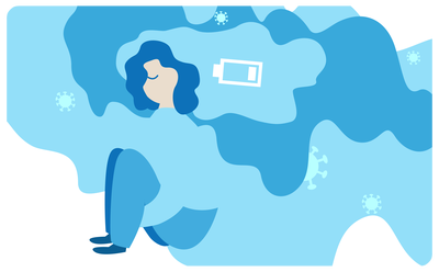
We want to better understand COVID-19 and its long-term effects.
With you, together.
Our Reports
Tap into our latest findings as we uncover them.

Introduction
In previous blogposts, we have already discussed the sociodemographics and spatial distribution of donors.
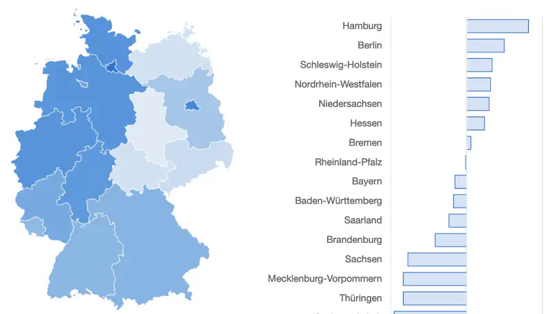
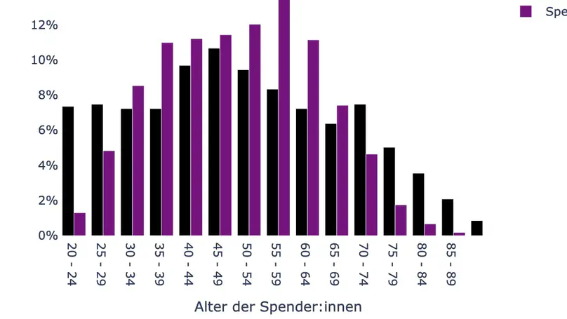
In this blogpost, we will again look at the sociodemographic composition and spatial distribution of donors. For the analysis, we will look at two selection levels each and compare them with the actual population composition (Census update, as of 12/31/2019). To do this, we look at sociodemographic and spatial distribution using three variables: spatial distribution at the state level (classified using the first three digits of the given zip code), gender, and age (recorded in categories of 10). In the first group, the data of the self-report at new registration of all data donors are analyzed, in the second group the data of the sub-study “tests, symptoms and living situation”. We would like to investigate two questions:
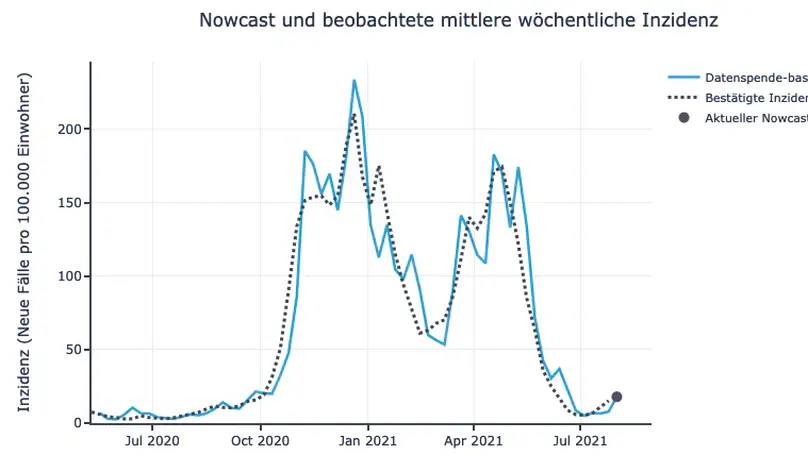
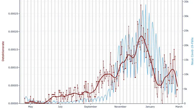
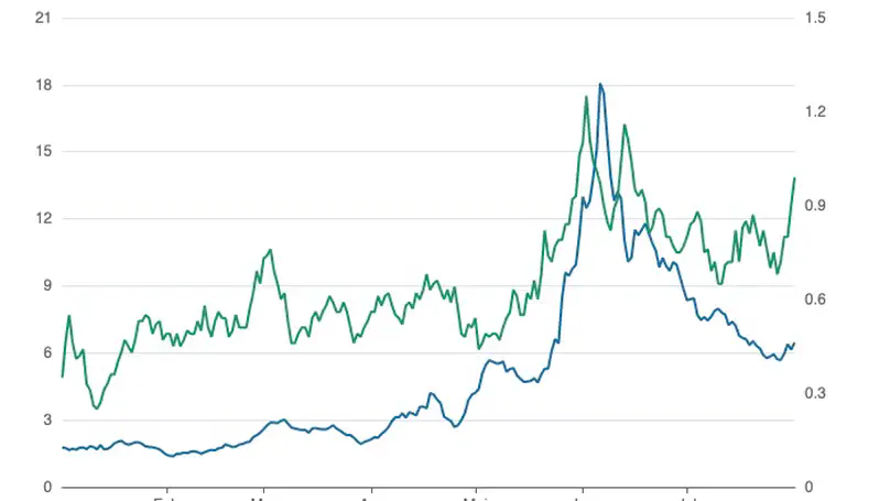
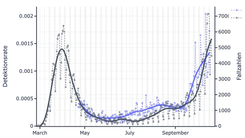
Dear donors, since the middle of December, we have seen a significant decrease in the number of confirmed COVID-19 cases in Germany until the end of February. However, until now the Fever Monitor has continued to deviate from the case counts starting around the beginning of the new year. In this post, we will try to explain why we think this happened and introduce to you our updated algorithm.
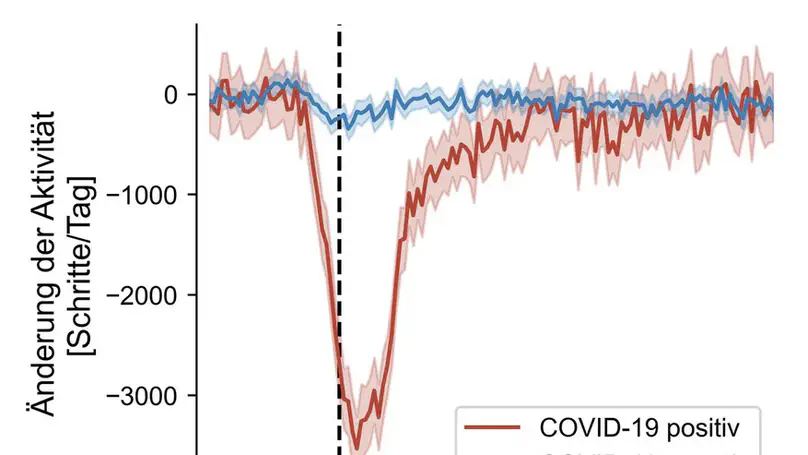
The Corona Data Donation Project is designed to detect fever symptoms in the time-series of the donors’ daily resting heart rate and daily step count signals. See blog post “How does it work?” for the mechanics of how the whole thing works and the basic idea behind it, or check out some of the preliminary results we obtained in the past.
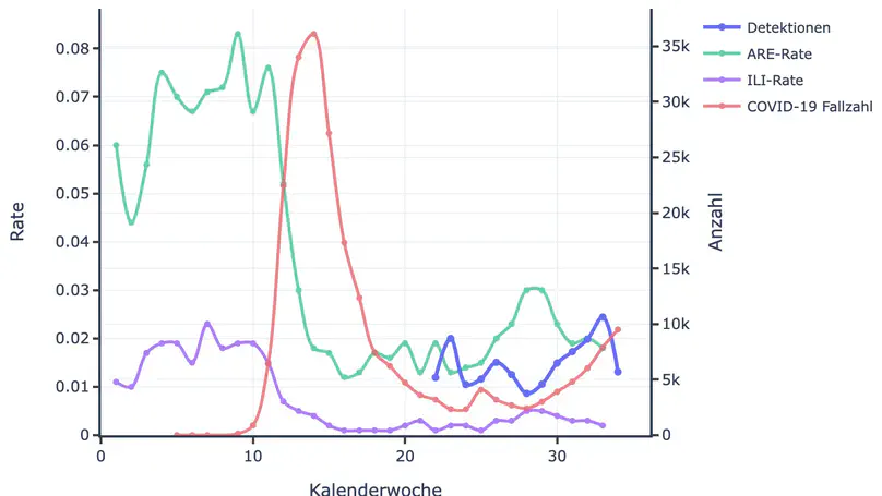
What is the fever monitor?
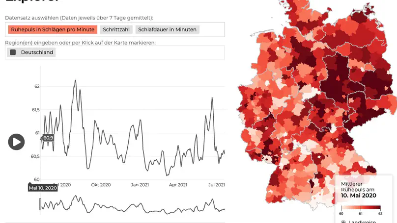
As of today, the Corona Data Donation Project features the Fever Monitor (see menu ‘Tools’ in the top navigation bar).
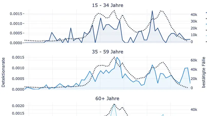
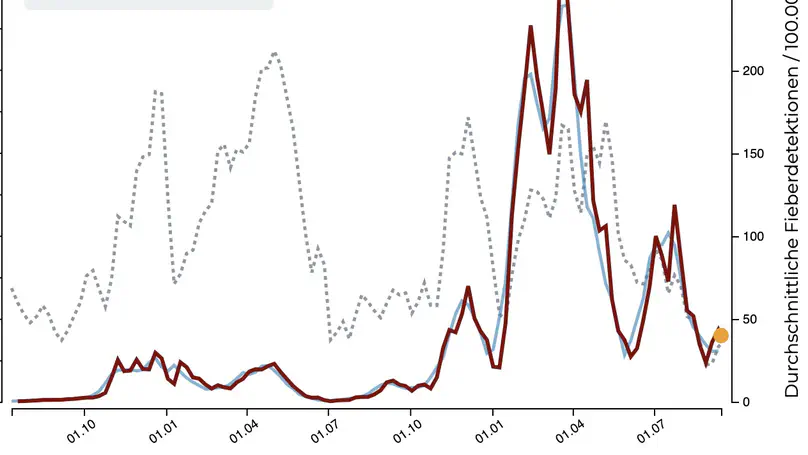
The monitor depicts the time course of the fever detections that we obtain from the raw resting heart rate and step count data the donors provide. Similar results were already discussed in the posts Feverish and Fever curves by federal state.
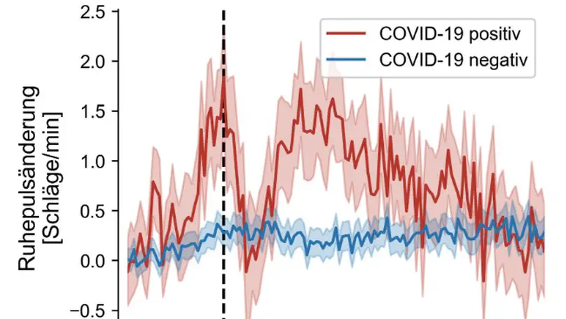
Remember the goal of the Data Donation Project? When we conceived and launched the project about three months ago we thought that we could use the daily donations of resting heart rate and daily step count to detect the onset of fever in donors which in turn would help us quantify changes in the dynamics of the COVID-19 pandemic because fever is a symptom of the infection. Details of the underlying scientific idea were discussed in the blog post How does it work?.
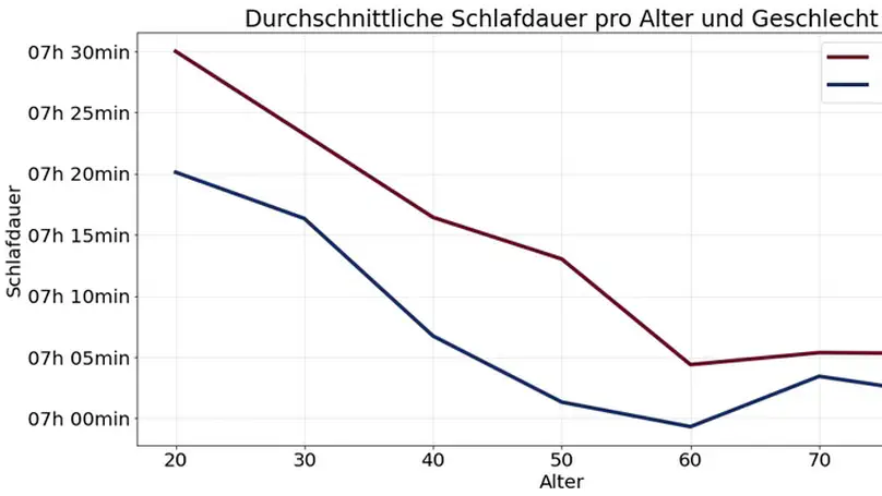
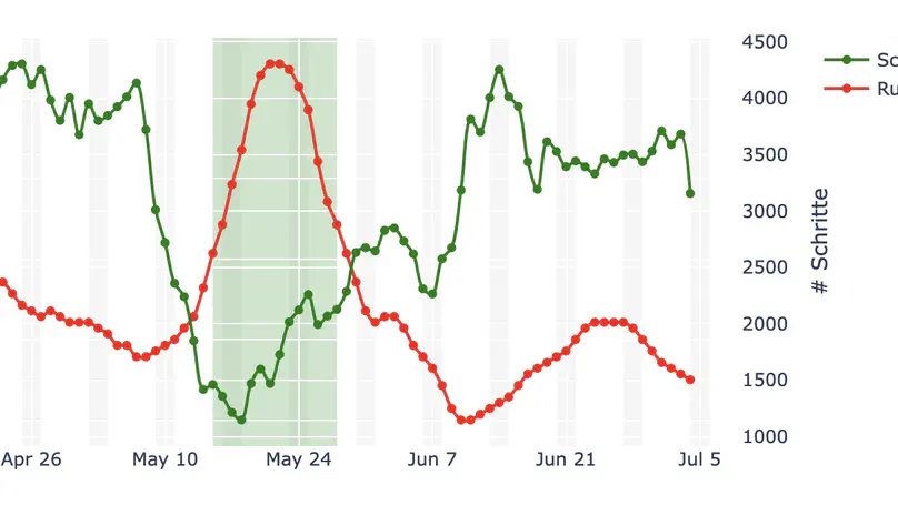
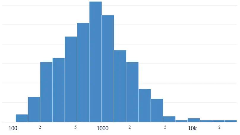
The distribution of daily step counts
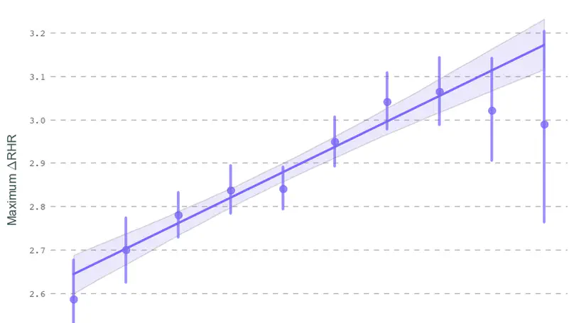
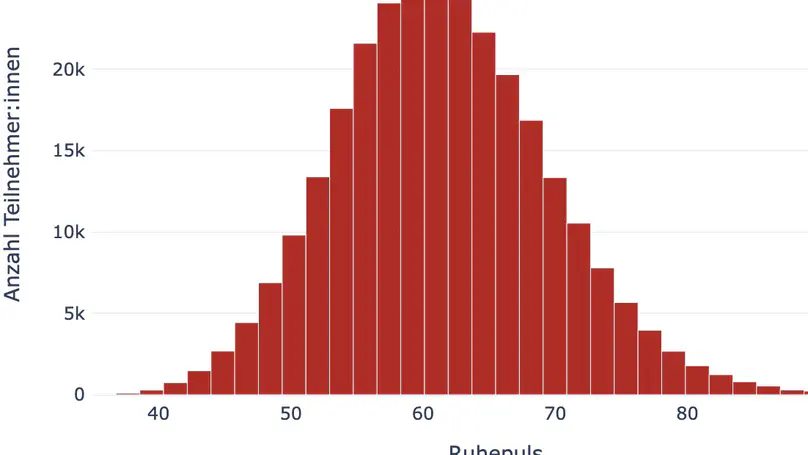
In addition to the daily average resting heart rate, we can obtain the daily step count from connected wearable fitness devices. Together with the resting heart rate, the step count is an important parameter for this study. As you can read in our post, The Pulse of the Nation, deviations from the average resting heart rate could indicate fever. However, resting heart rate may also deviate for various unrelated reasons.
Dear Corona Data Donors!
We would like to express our sincere gratitude and appreciation to all of you.
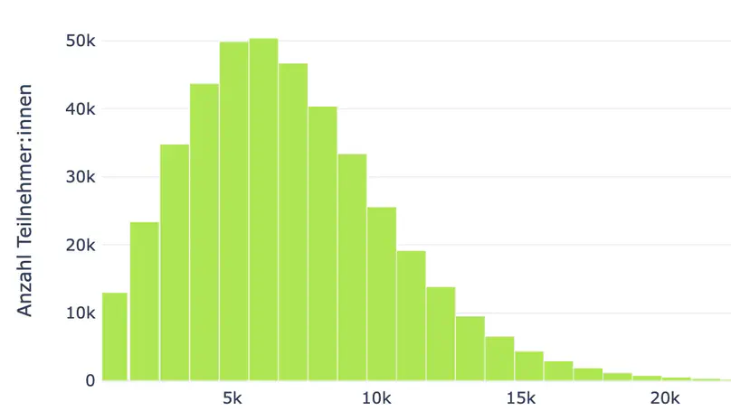
Together, you have created a community of 538174 donors (as of 16.06.2021). On average, there are about 1304 donors per municipality in Germany, which is far more than we initially anticipated when the project was launched. Each and every one of you who registered for the Corona Data Donation is equipped with a fitness tracker or smart watch, directly enabling you to contribute data essential to understanding the COVID-19 situation in Germany. Moreover, your donation helps us improve our predictive models and develop a so-called Fever Map for Germany
Meet the team
This research project is an effort of the project group Computational Epidemiology lead by Prof. Dr. Dirk Brockmann. It is supported by the data protection team (lead by Claudia Enge) at the Robert Koch-Institute. The scientific analysis of the data is coordinated in collaboration with the Research on Complex Systems Group (ROCS) at the Institute for Theoretical Biology and IRI Life Sciences at the Humboldt University of Berlin. The technical infrastructure, particularly the technology used to collect and process the data, is provided by the e-health company Thryve.
Core team
Dirk Brockmann
Professor
Annika Rose
PhD Student
Adrian Zachariae
PhD Student
Katharina Ledebur
PhD / Visiting Scientist
Paul Buttkus
Master Student
Robert W. Bruckmann
Master Student
Associates & Collaborations
Claudia Enge
Robert Koch Institute (DPO)
Lorenz Wascher
Robert Koch Institute
Johannes Lemcke
Robert Koch Institute
Daniel Grams
Robert Koch Institute
Ilter Öztürk
Robert Koch Institute
Ronny Kuhnert
Robert Koch Institute
Eva Winnebeck
Helmholtz Zentrum München
Cornelia Betsch
University of Erfurt
Philipp Sprengholz
University of Bamberg
Marie Luise Bohl
Robert Koch Institute
Christian Puta
Friedrich Schiller University Jena
Alumni
Paul Burggraf
COO Thryve
Marc Wiedermann
Alumnus
Hannes Schenk
Developer Thryve
Anja Müller
Alumna
Julia Geerlings
Alumna
Benjamin F. Maier
Alumnus
Marie-Luise Zeisler
Alumna
Jakob Kolb
Alumnus
Marie Reupke
Alumna
Patrick Schmich
Alumnus
Katrin Werth
Alumna
Susi Gottwald
Alumna
Frank Schlosser
Alumnus
David Hinrichs
Alumnus
About the project
At the beginning of April 2020, we launched the official Corona Data Donation App. Since then, over half a million people in Germany have decided to donate their data. For that, we would like to express our sincerest gratitude! There has never before been a research project of this magnitide involving the collaborative efforts of both citizens and scientists. It is really quite unique.
Some of you may be asking yourselves questions about the purpose of this project and the expected scientific results. What are we doing with your data donations and how will this help us better understand the current COVID-19 pandemic in Germany?
On this site, we would like to give you, the donor, a glimpse into the scientific process by sharing our findings as we uncover them. To achieve this transparency, we will regularly post updates detailing the methodological approaches and interim results of our analyses. We will do our best to clarify the motivation behind each stage in order to include everyone in this journey of scientific exploration as we work towards creating a Fever Map for Germany using vital signals collected by wearable health and fitness tracking devices and donated by you.
This goal of this map is to detect regions in which the number of residents exhibiting fever symptoms is higher than average. By updating the map on a daily and municipality-level basis, we aim to identify so-called “hot spots” of COVID-19 as they emerge. To learn more about how we intend to do this, please see our post How does it work?.